Understanding Color Space in Your Camera Settings
There’s never any shortage of potential confusion, even among many experienced photographers and tech folks, about color space, and which to use in-camera. Is sRGB enough? Isn’t AdobeRGB ‘better’, since it is ‘larger’?
Let’s start with some definitions, which along with the rest of this discussion, comes from brother and guest blogger R.L.Caron from R.L.Caron Imaging in Naples, FL. It’s noted that R.L. is a certified Adobe Lightroom Expert and this area of discussion is certainly among his specialities.
What is a color space?
Color space is a standard set of specifications… and can be defined as the size of the tent that contains the range of colors a particular digital imaging device can handle. The smallest and most restrictive of these is sRGB — which is the standard employed by 99% of the screens currently in use. It’s based on the range of colors reproducible on a consumer-grade computer monitor, HD television set, or ink-jet printer. Photos intended for Web or other electronic purpose most always should be rendered in sRGB. Print services such as Mpix, Bay Photo, Costco, CanvasOnDemand, My Publisher, and a thousand others expect to receive files in the sRGB color space. But check any you use to be sure.
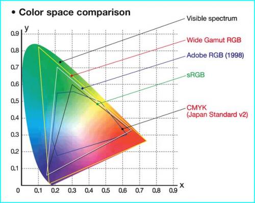
Next up the scale is Adobe RGB 1998. It’s way larger than sRGB — roughly representing the range of human vision and at one time the preferred in-camera setting for serious photographers. Raw shooters can disregard: In-camera sRGB will make the little monitor -driving jpegs look better. The raw file can be assigned a color profile at the output stage of the process.
Here’s a pictorial 
DSLR bodies offer a color space choice of Adobe RGB or sRGB. I’m suggesting sRGB — and here’s why:
Color space is a working environment — a room as it were — for the range of colors in a photograph. There are dozens of different color space standards — but only three are relevant to the kind of photography most of us engage in. ProPhoto RGB is the largest — and the best choice for Photoshop as it’s the default and only space for Lightroom. Next is Adobe RGB — perhaps the relative size of a movie theater compared to an indoor sports arena for ProPhoto RGB. The smallest color space, sRGB, is designed to contain all or most of the colors visible on computer monitors and those capable of being printed onto paper, canvas, or metal. It’s the size of your living room on the comparative scale.
A few years ago, the word was to always use the largest color space available — and that still holds true for processing. However, when generating output, be sure to match the color space of the device or process to which you are sending. That is most always sRGB. A majority of color processing labs — including those producing the highest end products — expect files in the sRGB space. That’s a wise choice because it’s matched to the capability of all of today’s state-of-the-art printers. Mismatched color profiles can result in washed-out prints or unnaturally tinted photos.
Back to the camera setting: I choose sRGB because it will give me a more accurate color rendition on the camera monitor — which is driven by a small jpeg generated within the raw file. A color space does not attach to the raw file until it is processed and opened in Lightroom — where it will properly be ‘assigned’ to ProPhoto RGB.
There is no advantage to raw shooters in setting the camera to Adobe RGB, and only in special cases would that be a good choice for those who need in-camera jpegs.
Sometimes, smaller is better — as sRGB surely is for 99% of jpeg output.
—-The operating color space is fixed in Lightroom, and you should also take the ProPhoto option in Photoshop. Matching those two apps is a good thing. Just give some thought to the color space of your output. The goal here is to match the color capabilities of the device for which the output is intended. For most of that, sRGB is the correct — if not mandatory — choice.
